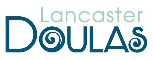
Let me share with you the story of our logo.
I’ll start by telling you that it takes time and maybe a little trial and error to find the graphic design artist that is a perfect fit for you. Having a clear vision and speaking the same language are important factors, like most of life, right? No bigs. In true doula fashion I was ready to support a new and budding life.
After some trial and error I had a clear idea of what I wanted to convey with our logo. New beginnings, trust, and strenght. I received our first batch of logos from our new found graphic design artist. As with most creative processes I asked to bring “this” feature in with “that” feature, and try “this” shape instead of ‘that” shape, and well, you get it.
I reviewed the first set of logos and gave my feedback. After receiving the second set I went back and looked at everything again. You know what? There was our logo! I couldn’t believe it. After completely looking it over the first time around, I have come to adore it so much. It has been a huge source of inspiration. How could I have overlooked this? Silly right….
Let me explain….
The beautiful symbol that acts as the letter O in the word Doulas, that is a Koru Symbol.
The Koru is often seen in images as the shape of a new unfurling fern frond (say that 3 times fast). The circular shape conveys the idea of perpetual movement, while the inner coil suggests a return to the point of origin. A metaphor for new beginnings, a fresh start, new life, growth.
The work we do comes from such a deep place in our soul, we welcome you to celebrate your new beginning with us. Thank you for taking time to learn more about Lancaster Doulas. We have so much to share with you!

